Monday, September 27, 2010

PROJECT 1: Rankin vs. Platon


This rotation I have been researching two modern and emerging photographers, Rankin and Platon. Both are very well noted for their work in portraiture, especially of celebrities and world leaders.
Recently Rankin has been working on several advertisements, most notably for the world cup. Including the Africa against AIDS foundation, and Nike. His eye for poses and backgrounds are really catch the eye and never fail to amaze.

Platon has photographed everything from ordinary people, to world leaders in Russia, to Bono. His use of close up photos of wide angle lenses are truly unique and prove to be very interesting shots. Platon is most renown for his many photographs of world leaders on the cover of multiple TIME magazine.

Friday, September 24, 2010

PROJECT 1: Digital (RAW)


For this project I decided to photograph portraits in (RAW) format. I think that portraits are a good way to show people at their best, and I tried to bring that out in my photos. Overall, I think that people believe that portraits are easy to shoot because you're just taking a picture of someone's face. But it is a lot harder than that, you need good lighting, the person needs to feel comfortable, and you need to position the person in the portrait where they are the main focus of the picture. I tried to use all of these points to make my photos concentrate on the people in them. I found a Group of homeless guys, who were happy with what they had, and were just hanging out. They were more than happy for me to take their picture. This specific guy (Jack) by far had the most character with his beard, and the wrinkles and cuts on his face. Overall i wanted to do something abnormal to break the barrier of portraits.


Monday, September 20, 2010

READING: An Insomniac Photographer

This is an article I found a while ago about a woman who photographs NYC at night. The photographs are stunning and her explanations are thoughtful and interesting. I particularly love the Pepsi-Cola photo.


Sunday, September 19, 2010

EXAMPLE: Timelapse Video and Slow Shutter


Timelapse Montage from Mike Flores on Vimeo.

Check out the above link. I thought it was pretty epic and amazing. Kind of makes me want to do some more light painting, or long exposure stuff in general. Maybe try out moth trails?


Saturday, September 18, 2010

PROJECT 1: Large Format

We've now moved onto our second phase of projects from the initial reorientation projects. For about a month or so, I have been given the opportunity to wrestle with and conquer the view camera (or in layman's terms: The box camera with the black cloth drapey thing.)

This week, I concentrated on trying to get my bearings with this camera and to familiarize myself with how it works. A view camera is essentially the same as a regular camera, but unautomated and with its inner workings exposed instead of encased in a shiny metal shell.

So far, I have taken 2 self-developing Polaroid photos (which work essentially as test strips) and 3 photos on film. I tried to include our white balloon theme in the film photos, as well as try to experiment with people photography.

Below are the Polaroid photos (I have not yet developed the film, and so unfortunately cannot share the film photos.)

Enjoy!

Thursday, September 16, 2010

PROJECT 1

Here's our first project rotation Sept 13 - Oct7

  • Alternative Photography - Laura
  • Large Format Camera - Kevin
  • Medium Format Cameras - Anna
  • Digital SLR & RAW Format - Craig
  • Biography Comparing Two Photographers - Phil
  • Event Photography - LeeAnne

READING: Emotional Sports Photography

At it's core, sports is about raw physical effort and intense emotions. I love how this photo conveys the friendship, respect and admiration these famous players had at the peak of their ability. Read the New York Times story to learn more about the photo and the photographer (John Varley).

Wednesday, September 15, 2010

DARKROOM PROJECT

In the first week, I worked on a number of things, namely a comparison of fiber paper versus resin-coated paper and a large photogram.

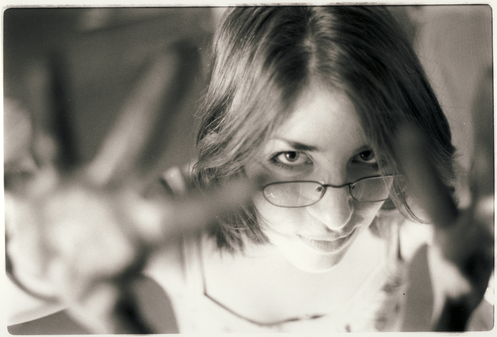
Below are the results of my comparison between fiber and resin-coated papers (model is the amazing Meredie Johnson).

Fiber
:

Resin-Coated

The main difference between fiber and resin-coated paper is that fiber paper gives everything a "warmer" looking color tone, in which the entire photo takes on a very subtle greyish-yellow looking tint. Resin paper in comparison has a stark cold, almost sterile-looking feel to it, where the whites and greys all have blue components.

Fiber paper also gives off much deeper dark colors, whereas dark colors on resin-coated paper appears to be more of a very very very dark grey (it has bluish hints, versus fiber paper's deep black.)

I would imagine that one would have to decide what effects are desired before choosing a paper type. Cold? Warm? Greyish? Black?

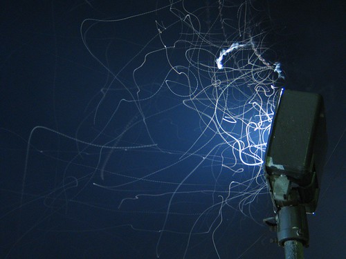
Next off is the photogram.


I collaborated with LeeAnne to produce a large human photogram that was 4 sheets of 20*24" resin-coated photo paper taped together. Our process involved taping the four papers together out in the safety light, then going into the film-loading darkroom and having LeeAnne lay on the floor so we could make the photogram by turning the lights on for 1 second.

To make the sparkling effect on the top corner, we used a spray bottle to apply spots of fixer before developing the photogram, which prevented the spots touched by the fixer from being developed.

Then, we separately developed each 20*24" sheet, as the large photogram would not have fit in the developing chemical trays.

All in all, I would say the first week was a pretty successful way to start off the new year with a theme of experimentation and thinking out of the box.

DARKROOM PROJECT


In class we did a comparison between resin and fiber paper prints. The fiber paper was rougher, curled up at the edges and needed a longer exposure time. It gave the image a warmer feel, versus the glossy bright resin paper. I liked the fiber paper better.

I also made a photogram with the help of LeeAnne, combining a negative taken at the Chihuly exhibit at the DeYoung with my profile. I made a test strip using the negative to determine my exposure time.

DARKROOM PROJECT

This week I experimented with the differences between Resin Coated, and Fiber Paper.  I used different exposure times under the enlarger, but used the same piece of film and level of contrast for both.  I tend to prefer Resin Coated paper just because I feel like you come out with a cleaner more athletic final piece, and I also like the crumpled leaf effect after development