Saturday, January 29, 2011

Our eyes are like cameras


Sort of. Here's an interesting article that explains the differences and similarities between our eyes and cameras. It also has a nifty diagram outlining the anatomy of the human eye.

http://www.pixiq.com/article/eyes-vs-cameras

Thursday, January 27, 2011

More Patterned Pictures


I have larger prints of the same picture, and I am photoshopping my darkroom work to make the patterns more clean and with sharper edges. I also fixed the contrast and brightness to show more details in the photos.

Medium Format Project


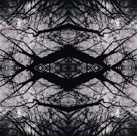
With medium format, most of my pictures ended up being blurry due to either motion blur, or my movement. However I was able to find a way to make patterns out of hte picturees i did have, and this is one example...

Photos of Beloved Objects


Here's an interesting item from the NY Times and a great idea for a photo project; recording beloved objects. I've seen some kid's treasures and favorite toys that were worn and used to almost unrecognizable objects. I also see a little humor in the title of the article... Those objects better be beloved if you are going to spend more than $500 for the photograph!

Tuesday, January 25, 2011

Photoshop In Magazine Covers: changing skin tones


In a recent study of many images published in magazines it has been brought to the public’s attention the fact that many photographers have been lightening or darkening the skin tones of people. For example in a recent issue brought up against Time Magazine, they seem to lighten and darken the image of President Obama. The same kind of image was brought to the public’s attention, only this time it was in Elle Magazine. The actress of precious, Gabourey Sidibe, was on the front cover however her image was lightened for this cover. The change was extremely significant.


Monday, January 24, 2011

Bubble Photography


Some bubble reflection photos.

Here's a tutorial:
http://content.photojojo.com/inspiration/how-to-photograph-bubbles-reflections/?utm_source=Photojojo+Newsletter&utm_campaign=bdfe4b7795-10_7_2010&utm_medium=email


Friday, January 21, 2011

WWII Image: The Famous Kiss

A photograph that has been talked about for a long time is the photograph of the Famous WWII Kiss. The image taken by Alfred Eisenstaed, captures the kiss between a U.S sailor and his lover. This image was taken in Time Square after the announcement of the end of the war. The entire square was full of joy and jubilation. Since then, the young woman and man have become figures of the war. The young woman, Edith Shane participated in many orginizations commemorating veterans and becoming a national known name and face. This image touched a lot of people because of its ability to bring out the patriotic emotions in Americans, and capture the joy that so many felt on such a momentous day. On June 24, 2010 Edith past away, however she left behind her memories, works, and spirit for life.


for more information about this story and article:

Thursday, January 20, 2011

The Zoom Effect

I recently noticed that some photographers utilize what is commonly called the "zoom effect" to give a sense of motion to their photos, leaving the subject centered and in-focus while everything else is blurred. People can get this effect through post-processing work or alternately by moving the camera close to the subject or using a telephoto lens and smoothly zooming in on the subject during a longer exposure.

Examples and tutorials below!


http://www.flickr.com/photos/casch/258138934/
Tutorials:

http://www.behance.net/gallery/Urban-Zoom/333146
http://dptnt.com/2007/10/the-zoom-effect/
http://www.digital-photography-school.com/using-the-zoom-effect

Wednesday, January 19, 2011

READING: Slow Photography

Do we take photos too quickly and without real consideration? Here's a short essay by Tim Wu on Slate.com encouraging photographers to slow down and enjoy the process. I think his key ideas are these:

Step 1 in slow photography is spending a long time studying the subject. As one guide enjoins, "pay more attention to your subject than to your camera." That's an order to actually use your eyes. [...] When you look carefully and avoid trying to label what you see, you inevitably start to notice things that you mightn't have otherwise.

"If Step 1 is a long consideration of the subject, Step 2 is the exercise of creative choices—the greatest pleasure that our automatic cameras rob us of. What should be in the frame and what should be excluded is the most obvious decision, but there's also exposure, depth of field, and more technical choices beyond that. [...] Yet these choices are, to my mind, the whole game. They are what individualizes photography, what puts the stamp of your personality on the photo."

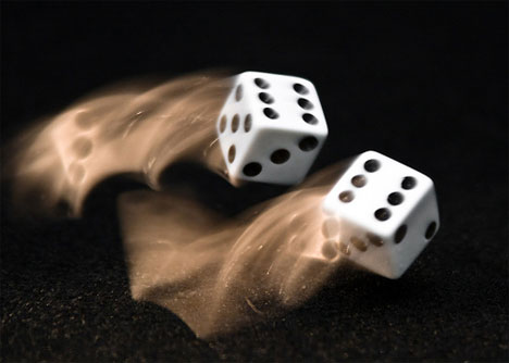
Motion Blur Photography


I like this style of photography because it takes everyday objects, and makes them either more interesting, or vibrant. I also like it due to the fact that you can take a hundred different photos of one thing, by moving it in a different way, or taking the same picture from another angle. Overall I think it produces some cool pictures.

Monday, January 17, 2011

Andy Goldsworthy


Andy Goldsworthy is an artist/photographer that is very interesting to me, because of his photo subjects. he makes temporary sculptures, that take him hours to make, and then photographs them. he only uses natural things such as rocks, leaves, branches, and water in order to achieve the result that has made his work unique.

Street Artist: Slinkachu

This British street artist, Slinkachu, sets up scenes using little people and props in cities he travels to, and then photographs them. He does it in series, with each photograph zooming out more, creating a new sense of proportion and space. His blog is here: http://little-people.blogspot.com/

Here is an example of a set:


Tilt/Shift

I have been experimenting with unusual digital lenses recently. The first one I tried out was a Lensbaby Tilt/Shift lens. I really liked the dreamy quality it gave my photos but it was difficult to get in focus. I found that it worked best for macros shots, rather than landscapes or portraits which didn't look as good with its unusual focus. Here are three variations on the same subject:


Friday, January 14, 2011

Amusing Troubles with Metering


Before the digital age, this one family tried taking pictures of their black dog. Unfortunately they weren't able to take a picture with their dog's face showing. Nonetheless, good stuff.

http://www.lensculture.com/kessels_2.html?thisPic=100

Thursday, January 13, 2011

BOOM


Spiffy time-warp of a flash. It's only 10 seconds and totally worth your time.

http://fstoppers.com/what-your-cameras-flash-looks-like-at-1052fps/

READING: Blogger Portraits

I enjoyed seeing these Voyeuristic Blogger Portraits on WIRED.com. For me, there is something very calming about seeing people zoning out inside their private spaces while bathed in gentle LCD lighting. Some of them look almost religiously transcendent. Do you react the same way to seeing them? What's your opinion?

Example: Alternative Photography- Scanograms

Scanograms are photographs made by placing objects on a flatbed scanner and then taking a photograph by scanning said objects. They can be quite interesting due to their depth of field and dramatic lighting effects. I particularly love the vivid colors in the examples below.


http://www.flickr.com/photos/austin_long/3488455102/

http://www.flickr.com/photos/austin_long/3487641619/
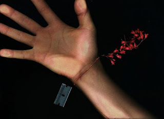
http://www.flickr.com/photos/austin_long/4096853953/in/set-72157617413315225/

Example: Alternative Photography- Lumen Printing

I recently discovered a form of alternative photographic printing called the Lumen printing process.

It's essentially a photogram made using the sun and a piece of moist organic material (ie: flower). The organic material is flattened against photo paper with a piece of glass on top, and then the sandwich is exposed to the sun (or UV light) for a period of time ranging from half an hour to a day. The volatile organic chemicals that are released by heating the organic material are responsible for making really funky colors on the photo paper.

After the exposure, the paper can simply be fixed using normal fixing and rinsing techniques (no development necessary).

Examples below:

http://www.flickr.com/photos/larryspinner/3242508397/
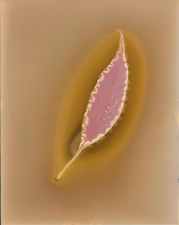
http://www.flickr.com/photos/larryspinner/3243343720/

Wednesday, January 12, 2011

First X-Ray Photograph


This was one of the first, possibly THE first, X-ray photographs taken. It actually has an entertaining backstory in which these three students broke into their professor's laboratory by bribing the janitor. They worked there late at night and exposed this image to x-rays for three hours to produce the first x-ray photograph. Today is its 115th birthday.

I think the objects in the picture are a cadaver's finger with pins in it, a rubber covered magnifying glass, a pill box containing two 22 cartridges, one pin, two rings, and six Strychnine pills (commonly used by students at that time to stay awake during finals), and an egg that been emptied and had a button placed inside. It kind of reminds me of the photograms we did in intro photo.

http://gizmodo.com/5731754/how-three-college-kids-illegally-captured-the-nations-first-x+ray-photograph

Tuesday, January 4, 2011

Example: Alternative Process Examples (Liquid Light)

Here are a few examples of Liquid Light emulsion projects that I found while browsing on Tumblr for inspiration. I've personally been thinking of trying to work with plain, geometric patterns in images that have been printed onto something with a texture that complements the pattern (ie: photographing leaves and printing it onto a piece of plywood.) I'm also curious about how Liquid Light might turn out on metal or maybe even glass (I'm assuming it would have to be frosted or otherwise roughened in some way to hold onto the Liquid Light.)

Enjoy.

http://www.flickr.com/photos/24672404@N07/2338908153/


http://www.flickr.com/photos/kazz/5135709341/


http://www.flickr.com/photos/brittany_photography/2091869038/


http://www.flickr.com/photos/andchristina/4206696392/

Overbearing Authority


I was talking with my sister about her summer plans earlier this evening at dinner about her summer job at the US embassy in France, I decided to look at some french photography/journalism, to try and catch a glimpse of what is happening in the world of photography in France. I opened the link to" Photo.Fr" and this photo immediately caught my attention

I clicked on the link and I could not understand a damn word, I got my sister to translate and tell me what was going on in this photo. Evidently, the protestor being attacked by the riot police, took place in Quebec, the French speaking part of Canada, and where my sister happens to study.

I also stumbled upon this seemingly disturbing image on the page:


A very interesting and intriguing photo... yet I'm still not sure what to make of it

I'm usually not a fan of photoshop


But these contest winners caught my eye. I have always believed that "good" photography is can only be found in the first shot, or with minor adjustments in contrast, or other small changes that do not change the composition or subjects of the photo.

However while browsing through an online photography magazine, this photo really caught my eye:


Like I said, I'm really not a big fan of over editing, but I have to say I was more than intrigued when I saw this photo. The light work is really spectacular in this photo. While I usually label overly photoshopped pieces as graphic design, the major of the winners of this contest I respect greatly as photography.


To check out more photos like these visit:
http://www.popphoto.com/content/share-monthly-photo-challenge?pnid=68474

Monday, January 3, 2011

Winter in NYC

Here a few photographs I took during the day of the blizzard in NYC, in a somewhat chronological order:


French Street Art: Photobooth

The French street artist Fabian David did a project in Lyon, France, where he stood on the street with a digital camera and a printer and photographed the first 100 people to walk by him. He printed out each photograph and attached it to the the wall of a building, creating a photo collage of people in the neighborhood.

Here are some photos from the event:


He posted photos of the art on his website, here:
http://studio-mw.fr/index.php?/project/perffusion-2010evenement/

Biography Comparison- Francisco Mata Rosas & Marco Antonio Cruz

Francisco Mata Rosas

Francisco Mata Rosas was born in Mexico City. He received a degree in photo-journalism early on in his career in photography. He is a well known Mexican photographer whose work is also well known in the United States. His photography has been published in various works including some that are well known here, like The New York Times and the Los Angeles Times. His photography has also been published in other foreign countries as well like in the magazine El Pasiente from Spain and Photography in London. His work has also been exhibited all over the world in many different countries. His two most popular series are Sabado de Gloria which focuses on Holy Saturday in Mexico in which people recreate the suffering of Jesus Christ. His other famous series is Litorales which includes many panoramic images of the seashores in Mexico. A unique quality of Francisco Mata Rosas is that he really enjoys working with toy cameras and his series Litorales was taken with a Ansco Pix Panoramic. He enjoys working with Black and White photography and when taking photos at times he focuses patterns. In many of his photos he captures the essence of Mexican pride and the roots of Mexican heritage that help keep them alive for the ever changing generations to come.


Marco Antonio Cruz

Marco Antonio Cruz was born in Puebla, Mexico. Originally he was studying painting, however he soon discovered his talents and interests in the art of Photography. He was inspired by the works of Nacho Lopez another Mexican photographer. His photography has been published in the LIFE magazine and La Jornada the Mexican Newspaper. The most well known image of his in LIFE magazine was that of his image of the 1985 Mexico City earthquake. His work has been exhibited all various times in the U. S and in Mexico. Marco Antonio Cruz has published two books, Cafetaleros and Contra La Pared. His most famous series was one that including going around all of Mexico and photographing the blind in order to tell their stories and help educate people about the life of the blind and their conditions they live in. Although Marco Antonio Cruz does not specifically say he is a photo-journalist he does a lot of work in this field. His work is mainly in black white and has unique angles and that help add a stronger point to the photos. He plays heavily with contrast.


PROJECT 4

Here's the rotation sequence for project 4 (Jan 4 - 31):

Laura - Large Format
Kevin - Alternative Process
Anna - Digital
Craig - Medium Format
Phil - Large Format
LeeAnne - Medium Format

Sunday, January 2, 2011

Examples: Vanity Fair 2010

So I was doing a bit of random browsing as a means of procrastinating writing this college supplement essay of mine, and I stumbled upon this and this. They're a two-part recap of some portrait photos featured in Vanity Fair over the course 2010, and I think they're all pretty cool.

You all might recognize some of the photographers (ie: Anne Leibovitz).